Content Information
On this page...
Fonts
Generally, the most accessible fonts for websites are fonts in the sans-serif family. Arial, Helvetica, Open Sans, Tahoma, and Verdana are some examples of commonly used sans-serif fonts that are sufficiently accessible for all users in most platforms. It is best to use fonts that are commonly used and widely available.
The default system font allows the user’s operating system to determine the typeface and is a good selection to make for websites:
- Mac OS, iOS default font: Helvetica
- Windows OS default font: Arial
- Chrome OS, Android OS default font: Roboto
Tips for Fonts:
- Limit the different styles of font used, choose one and use it consistently through your entire website.
- Avoid using ALL CAPS as it can be more difficult to read and challenging for screen readers to parse.
- Use italics, bold, and underline selectively and avoid using for an entire paragraph.
- Left-aligned text is easiest to read; use center-aligned text sparingly.
Sizes
Website text size matters for two main reasons: the first is ensuring that the default font sizes are not too small. The second is making sure that website text can be resized up to 200 percent without loss of content or functionality.
Being able to zoom in on text also benefits users who do not use assistive technology, as well as those using mobile devices (which resize text automatically). Testing this yourself is easy: simply hold down Ctrl and tap the + button on your keyboard, or manually select the zoom value from your browser settings.
Choosing a font size that’s too small (or too large) can decrease readability. This makes it more difficult for users to understand your content and navigate your website. The WCAG standards don’t directly specify font sizes, but web designers often start with these basic sizes:
- Regular body text: a minimum size of 12pt is generally suggested.
- Large text: a size of 18pt (24px) is typically recommended as a minimum.
- Default fonts: no smaller than 9 pt; smaller sizes may be unreadable on some platforms.
Note that formatting regular body text as larger or bold to designate headings or subheadings on your webpage is not recommended; use the preformatted heading styles in the website editor to meet accessibility guidelines. Refer to Structure & Headings for more information.
Back to topText Overlaying Images
Placing text over an image is a common practice in modern website design. While this can enhance a website’s visual appeal, it can introduce accessibility barriers for users.
Text should not be presented as part of an image unless it’s essential to the information being conveyed. Screen readers are unable to interpret text that’s embedded in an image and rely on the alt text to describe the image to users. See Alternative Text for more information.
Including a large amount of text in an image can make it difficult for all users to read and challenging to summarize for alt text. It’s better to include no text at all, or only a few words on an image, and include any accompanying text in the body of the webpage.
It’s also important to ensure enough color contrast between the text and the image behind it. Images with patterns, graphics or different colors are harder to contrast with text than solid color backgrounds.
Back to topAdditional Resources
- Understanding WCAG 2.1: Images of Text (Level AA)
- WebAIM Typefaces and Fonts
- Understanding Accessible Fonts and Typography (Section 508 Compliance)
- Canva Help Center: Use Design Accessibility
PLOW Website Instructions
Font
The default font in Concrete5 is Aptos and is in the san-serif family.
Size
The Concrete5 platform is in compliance with text size requirements for accessibility. Webpages in Concrete5 are responsive and able to zoom in to 200% without losing content or functionality. The default text sizes in Concrete5 correspond to the hierarchy function of the text, such as Headings and paragraphs.
Example: Images of Text
In the example screen grab of a PLOW website homepage below, the text overlaid on the banner image does not have a high enough color contrast for the image behind it to meet accessibility standards.
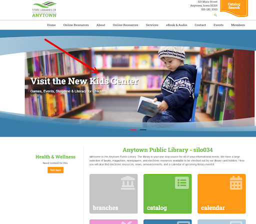
Solution: Lighten the image or increase the transparency using an image editing tool and use a dark-colored text to meet contrast guidelines. Another option is to use an image with a more solid light or dark background color and an appropriately colored text for contrast on top.
For more information on color contrast requirements, see Color.
Back to top