Content Information
On this page...
Contrast
At the core of accessible color design is the concept of contrast ratio. Contrast ratio refers to the difference in brightness between two colors (usually text and background) on a website. This ratio measures how well the colors stand out from each other, which directly affects the readability of the content.
The contrast ratio scale ranges from 1:1 (no contrast, like white text on a white background) to 21:1 (maximum contrast, such as black text on a white background). WCAG standards require a minimum contrast ratio to ensure readability.
Minimum Contrast Ratios
- Normal text: 4.5:1
- Large or bold text: 3:1
- Exceptions: Text that is part of an inactive user interface component, pure decoration, not visible to anyone, or that is part of a picture that contains significant other visual content. Also, text that is part of a logo or brand name does not have a contrast requirement.
By meeting contrast standards, you’re ensuring your site is as readable as possible, especially for people with low vision or color blindness. As a bonus, high-contrast color combinations tend to improve the overall user experience by making content clearer and more visually accessible.
Testing Color Contrast
A color contrast checker or generator can verify that your website content meets WCAG compliance. Try these free tools:
- WebAim Color Contrast Checker
- WCAG Color Contrast Chrome Extension
- Venngage Accessible Color Contrast Generator
Dependence
Avoiding color dependency means making sure that a user does not need to be able to perceive different colors in order to understand and use your website. You can still use color to help accent or emphasize content, but it cannot be the only way you communicate information to viewers.
Back to topHex Color Codes
A hexadecimal (hex) color code is a six-digit alphanumeric code, typically starting with a # symbol, that is used in web and digital design to represent the spectrum of colors.
It defines colors using the RGB model, where the characters represent the intensity of red, green, and blue. A unique color is generated with #RRGGBB, where the RR (red), GG (green) and BB (blue) values specify each component of the color.
Back to topTips for Using Color
Back to topAdditional Resources
- Understanding WCAG: Contrast (Minimum)
- Making Color Usage Accessible (Section 508 Compliance)
- 7 Core Accessibility Skills: Contrast (University of Minnesota Office of Accessibility)
- Accessible Data Visualizations, Charts, and Graphs (Harvard University Digital Accessibility Services)
PLOW Website Instructions
Concrete5 makes it simple to adjust colors on PLOW websites. First, it’s a good idea to have contrast-compliant color hex codes selected before changing colors on your website.
Test that colors on a webpage pass contrast requirements by entering the URL in an accessibility scanner tool such as the Wave WebAIM scanner.
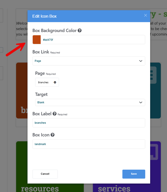
Edit Icon Box Colors
The Icon Box content block in PLOW websites uses a colored, rounded square with short text and a grapic icon to link to another resource. To change the color of the icon box:
- Click on the icon box that you want to adjust, then click Edit Block.
- Click on the field labeled Box Background Color. Use the color selector tool or enter the hex color code of your choice. Be sure to select a dark color to ensure enough contrast (the text on these boxes is white by default).
- Click Save and publish changes.
Edit Linking Resources Block Colors
The linking resources content block on PLOW websites combines a heading style (name of resource), an image (logo with alt text), paragraph text (brief description), and an interactive link button to the resource destination.
In this example of a PLOW website linking resources block, the orange color (#FEA32E) of the link buttons does not contrast enough with the white text.
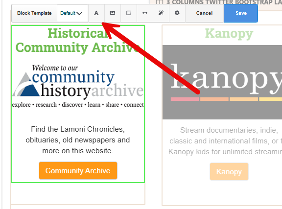
To edit the text color:
- Click on the block to edit, then click Design & Block Template, and click the “A” icon in the toolbar (text options).
- Select a high contrast color. In this case, we’ll change the text color to black (#000000) to achieve the required level of contrast.
- Click Save and publish changes.
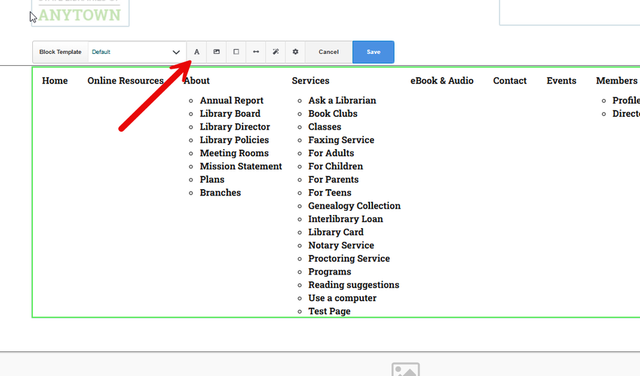
Edit Text Color in the Navigation Bar
- Click on the Navigation content box, then click Design & Block Template.
- Click the “A” icon in the toolbar (text options), adjust the link color to a high contrast color.
- Click Save and publish changes.